Sale Price:
$238.50
Original Price:
$265.00
October 23 to November 13 (Fridays), 12:00 PM to 3:00 PM, Eastern Time
**All sessions are live and will be recorded, students do not have to be present. All recordings will be available to students for 3 months after the final session, after 3 months the recording will be deleted.
Please check your email spam/junk folder for your Zoom invite. Our business hours are 10:00 AM through 5:00 PM. All course information and email correspondence will be sent during business hours. If students purchase a course, workshop, demo or recording outside business hours or during the weekend the course information or recording will be sent the following business day.
DEMO: https://youtu.be/z0E4-IXt_-Y
Course Description
Photos allow painters a closer examination of spaces we couldn’t normally paint from life and allow for an exploration of spontaneity and visual ambiguity if we don’t use the image to paint every detail.
Learn how to select photos that will make great paintings and how to manipulate and combine photos for the best composition. Also learn how to avoid some of the pitfalls photos can present us.
Photography is a great tool for artists, but we don’t want to copy everything the camera sees! During the week I will review student’s paintings in Padlet and offer suggestions. We will briefly review work or go over questions before each new session.
Course Outline
Week 1 -
We will talk about how to choose a good reference photo for painting and about the limitations of photos and how to overcome them. We’ll briefly cover some handy apps and editing tools.
I’ll share my process for choosing and editing a photo and begin a painting to demonstrate my techniques.
Assignment: This week select some photos and play with cropping so that you have dynamic value and shapes. You can use paint or pen to put together some good ideas for painting studies.
Week 2 -
This week we will spend a good bit of time on composition and design. We don’t want to copy everything the camera captures but make choices that will make the most interesting paintings. I will demonstrate how I group big value/color shapes to unify busy areas and lead the viewer to my center of interest. Students might want to paint along this week.
Assignment: Work on ideas of design and simplify busy scenes before starting a painting based on your design. Show your work.
Week 3 -
Sometimes you need a figure from one scene but the background in another. We’ll talk about how toaccurately measure and combine references as well as make sense of color and light differences. I’ll demo these techniques.
Assignment: Practice the lesson with photos of your own.
Week 4 -
We will continue to talk about leaving the rigidity of the reference behind and play with exaggerating or flattening perspective, inventing color palettes, and creating an interesting expressive scene. I will demonstrate leaving things undone and implied. Students may want to paint along this week as well.
Assignment: choose a color palette, play with cropping, exaggerating, flattening or unusual perspective
Course Materials
SUGGESTED SUPPLY LIST
All mediums are welcome! I will be painting in oils.
These are what I use, and students may want to try my colors or tools, but it isn’t necessary to try all new techniques and materials – use what is most comfortable for you. Sometimes experimenting with different painting surfaces adds a new dimension to your textures and paint application.
Painting surfaces – gessoed or canvas panels
A pad of canvas or oil paper is convenient to paint quick studies. Canvas paper like Arches or Legion are fun as well as a Yupo paper and duralar polyester film.
Give yourself enough room to work – 9x12 – 16x20
Brushes – a variety of long handled hog bristle (for oils) and a few softer hair/synthetic brushes.
I like round and filbert bristle brushes sizes 4-8
Additional items: paper towels, chip brushes, palette knives and other scraping tools – cards, bowl scraper, etc.
COLORS*
Reds: Napthol Red
Alizirin Crimson Permanent
Yellow: Hansa Yellow
Orange: Permanent Orange
Blues: Ultramarine Blue
Kings Blue
Purple: Manganese Violet
Green: Pthalo or Viridian
and
Titanium Zinc White
Sometimes: Meadow Green (Cad Green), Water Green (Charvin brand), Cerulean hue or some of the radiant/pastel colors from Gambin
MEDIUMS
Gamblin Solvent Free Gel
Mineral spirits (Gamsol)
Linseed or walnut oil
* I use paints that do not have toxic heavy metals. Sometimes the pigments may differ slightly – the permanent orange is more vibrant and semitransparent compared to cad orange etc. The brands I recommend are Winsor & Newton, Rembrandt, M Graham, and Charvin. I find these have a buttery quality and good pigment load.
 Image 1 of 8
 Image 2 of 8
 Image 3 of 8
 Image 4 of 8
 Image 5 of 8
 Image 6 of 8
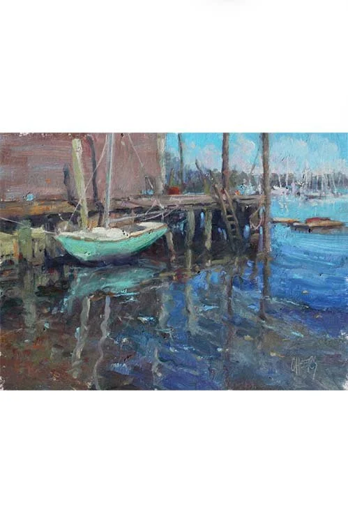 Image 7 of 8
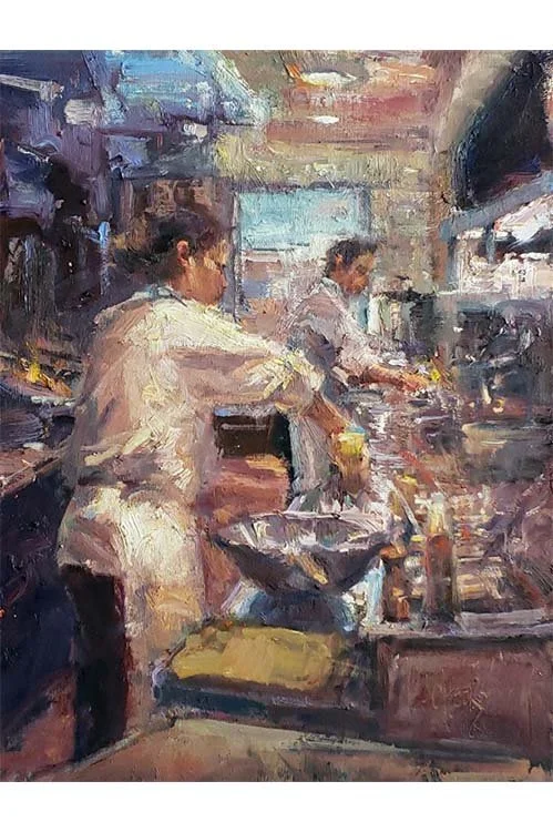 Image 8 of 8