February 4 to February 18 (Wednesdays), 10:00 AM to 1:00 PM, Eastern Time
**All sessions are live and will be recorded, students do not have to be present. All recordings will be available to students for 3 months after the final session, after 3 months the recording will be deleted.
Please check your email spam/junk folder for your Zoom invite. Our business hours are 10:00 AM through 5:00 PM. All course information and email correspondence will be sent during business hours. If students purchase a course, workshop, demo or recording outside business hours or during the weekend the course information or recording will be sent the following business day.
DEMO: https://youtu.be/2YeFj9twVYI
Workshop Description
Aline is known for her vivid paintings and creative use of color. Working from their own photo references, students will transform these into pastel paintings using the principles of color and design. Along with a painting demonstration each time the class meets, Aline gives a lot of individual attention based on a students’ level. Aline will emphasize the understanding of color in terms of temperature, intensity and value while translating those ideas using pastel technique. Experimenting with exciting different color while maintaining the value and intensity will serve as a great exercise in helping students expand their color sensitivity. Let’s say goodbye to overworked tight pastels and learn to create loose, bold but still illustrative paintings.
Workshop Outline
Week 1
Start with a simple lecture on color theory, values, composition and design.
We will discuss the three concepts of color: value, intensity and temperature.
We discuss designing with value.
Demonstrate how to play with photo references to create the best design.
Demonstrate a landscape demo illustrating these principles in relation to pastel technique.
Homework: Take some of your reference photos and show how you can change the designs for each one.
Week 2
We will discuss making thoughtful, authoritative pastel strokes.
This day will involve doing 10 to 15 stroke exercises using one well lit object for each small pastel painting. The idea is to use only 10 strokes to define the object.
If there is time, we will also do small landscape paintings where the student changes the color theme for each one using their same reference photo.
Homework: Take one object and start with 10 strokes, photograph it, then go on to finish the painting.
Week 3
We will discuss thinking abstractly to create an illustrative painting.
Demonstrate a street scene while discussing looking at buildings and people as objects without assigning names to them. This allows the artist to draw what they see as shapes and not what they think they know.
Workshop Materials List
Most supplies can be purchased online for reasonable prices. The larger sheets of paper can be cut into smaller sizes and I suggest working small at least in the beginning.
Suggested sites: Art Supply Warehouse, Jerry’s Artorama, Cheap Joe’s, Dick Blick and Dakota Pastels
VINE CHARCOAL....just a few pieces
PORTABLE EASEL unless they are provided
DRAWING BOARD
YOUR OWN PHOTO REFERENCES ANY SUBJECT MATTER
PASTEL PAPER CHOICES:
Colorfix Art Spectrum is rougher but I love it. UArt is very popular though I don’t tend to use it and it may need a tone put on, Luxe Archival is nice but you may want to tone it with pastel and alcohol or watercolor. Pastel Mat is great and my current favorite. It has a nice finish and can take a lot of layers. Canson paper is not great especially for building color but it is less expensive. There are many sanded papers and Dakota Pastel will send a sampling.
Art Spectrum Colorfix Paper. Any colors but white or very light I prefer Terra Cotta, Raw Sienna,
Aubergine, and other darks…you can get sample packs
Pastel Mat…the wine color is great
U Art…I’d get a pretty fine tooth. There are different grades of tooth…I don’t use it but it’s quite popular. I like to have a toned surface.
Sennelier La Carte Sanded Pastel Card (keep in mind it cannot accept any moisture) It now has a mixed media paper that can take moisture but I I haven't tried it yet.
PASTELS:
Pastels vary a lot in softness and expense. If you are just starting out, then there are half stick sets available and a good way to get more colors for less money. The best ones are by Unison, and are available at Dakota Pastels (google it) but if you want to get full sets, you may find the other sources cheaper. A selection of some hard and soft is best. For hard and cheap pastels, Nu Pastels are good. A large set isn’t too expensive and a good addition to any set.
Terry Ludwig soft and rectangular…a favorite of mine Great American also soft and rectangular and a favorite Blue Earth also soft and rectangular…wonderful pastels
Unison...a great solution especially if you only get one kind.
Schminke creamy but am preferring the Terry Ludwigs
Girault
Ones I would avoid are Rembrandt and Windsor Newton.
There are many others, but these are the best for me.
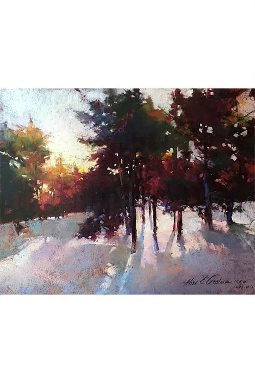 Image 1 of 16
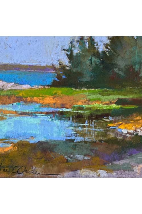 Image 2 of 16
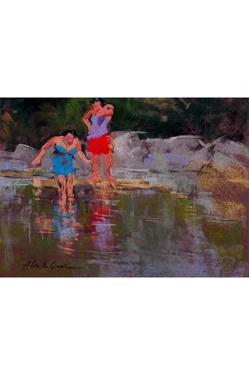 Image 3 of 16
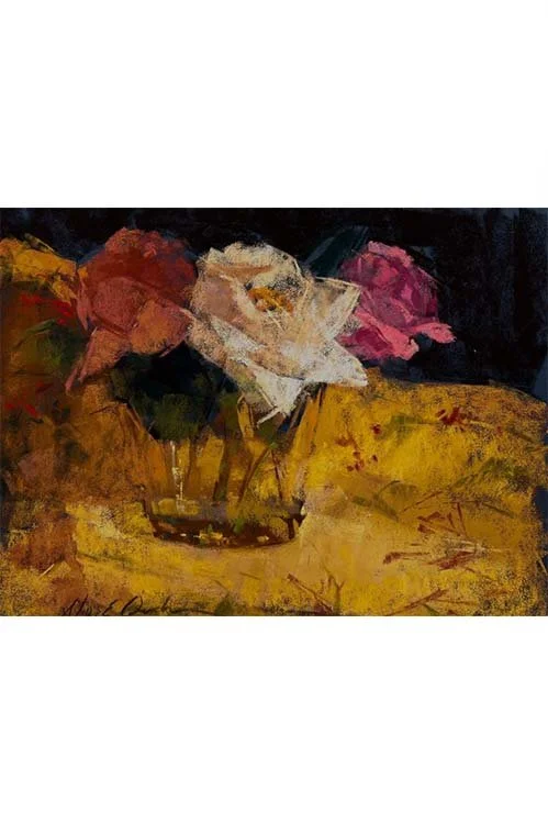 Image 4 of 16
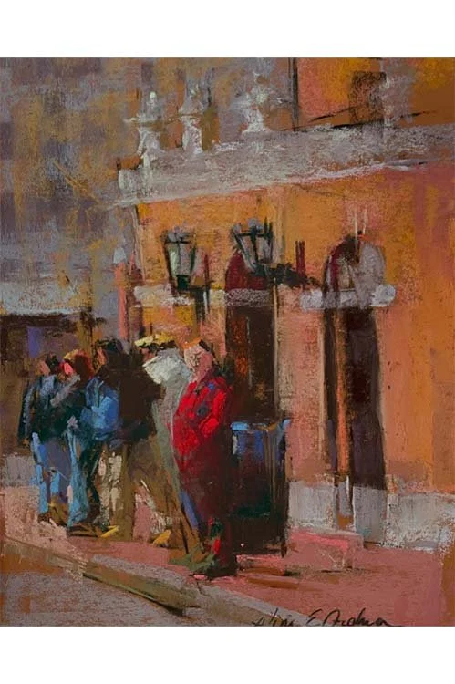 Image 5 of 16
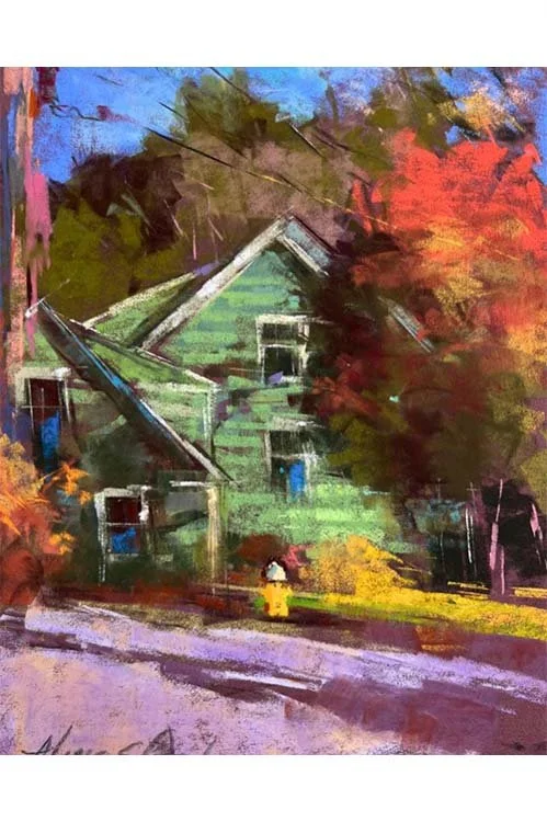 Image 6 of 16
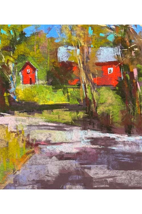 Image 7 of 16
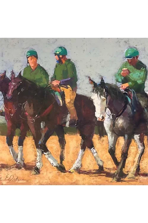 Image 8 of 16
 Image 9 of 16
 Image 10 of 16
 Image 11 of 16
 Image 12 of 16
 Image 13 of 16
 Image 14 of 16
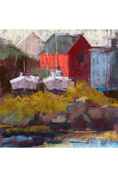 Image 15 of 16
 Image 16 of 16